


Zesfy.com Audit

We’ll go over what’s working great and where there’s room for improvement. Ready? Let’s get started!
What’s Working Really Well
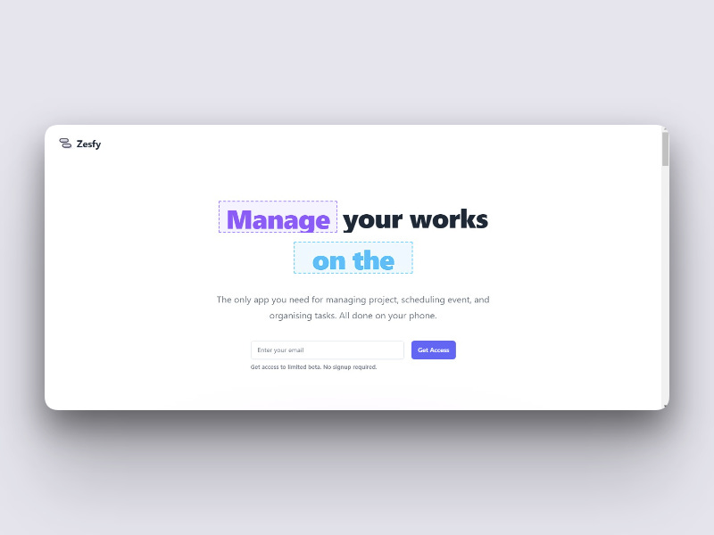
1. Sleek and Modern Design
The design of Zesfy.com is sleek and visually appealing.
The modern aesthetic with a clean layout and engaging visuals helps create a strong first impression. The color scheme is fresh and professional, making the page look polished.
2. Clear and Engaging Headline
The headline, “Zesfy: Your Go-To Solution for Effortless Financial Management”, is clear and immediately communicates what Zesfy offers.
It’s straightforward and sets up the value proposition effectively.
3. Strong Call-to-Action (CTA)
The “Get Started” button is prominent and eye-catching. It’s well-placed and easy to find, making it simple for visitors to know what action to take next.
The text is inviting and encourages users to click.
4. Effective Use of Visuals and Copy
The visuals and copy work well together to explain Zesfy’s features and benefits.
The icons and screenshots are helpful, and the copy is concise yet informative. This combination keeps the page engaging and easy to follow.
5. Clear Features and Benefits
You do a great job of listing key features and explaining the benefits of using Zesfy.
This helps visitors quickly understand what Zesfy offers and why it’s valuable. The bullet points and short paragraphs make the information easy to digest.
A Few Ideas for Improvement
1. Make the Hero Section More Engaging
While the hero section is clean, it could be more dynamic.
Adding a video or an interactive element could make it more engaging and capture visitors’ attention right away.
What to Try:
Consider adding a brief demo video or an animation that highlights Zesfy’s main features and benefits. This could make the hero section more interactive and compelling.
2. Add Social Proof for Increased Credibility
There’s currently no social proof on the page.
Adding testimonials, client logos, or success stories could help build trust and show that others have had positive experiences with Zesfy.
What to Try:
Include testimonials from satisfied users or display logos of companies that use Zesfy. You might also add case studies or success stories to demonstrate real-world impact.
3. Highlight Benefits More Clearly
While you mention features, there’s an opportunity to better highlight the specific benefits of these features for the user.
What to Try:
Update feature descriptions to focus on user benefits. For example, instead of just saying “Expense Tracking,” you could say “Expense Tracking to Keep Your Finances in Check and Save You Time.”
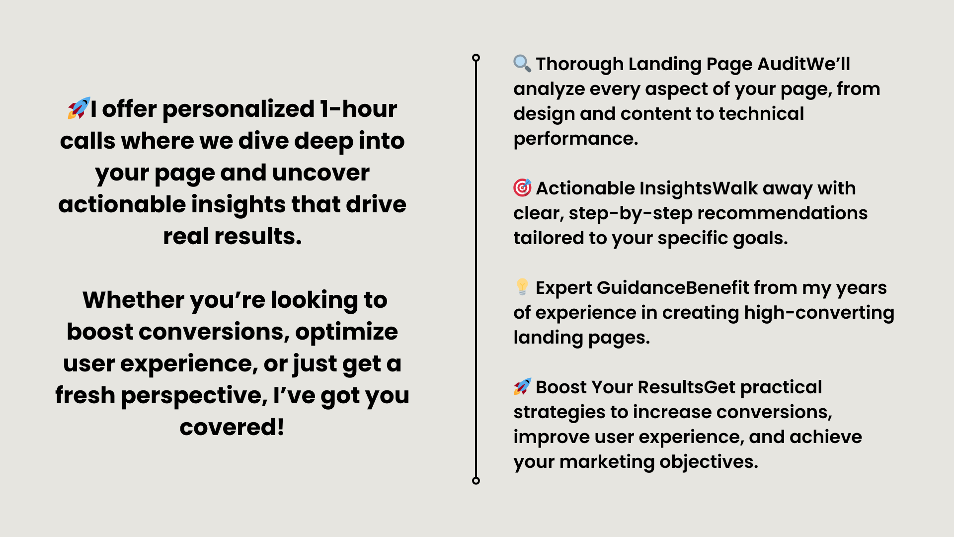
book a call with me + a document breakdown - HERE
get a document breakdown of your landing page - HERE